| Abstractics XmlPanel | |
| A flexible Java Swing Runtime Layout Manager | Current Version: 1.1 |
General
Documentation
- Quick Start
- Layout Concepts
- Layout Examples
- Floating Components
- Component Factory
- Misc Properties
- Converter Utility
- JavaDoc
Layout Examples
Independent Rows
The previous section mentioned that the XmlPanel has rows that are independent of each other. Unlike HTML tables, the XmlPanel does not force a logical grid. There is no need for spanning columns. As an example, look at the following XML and resulting layout.
<panel>
    <row>
        <cell type="button">Very wide button</cell>
    </row>
    <row>
        <cell type="button">Small</cell>
        <cell type="button">Slightly larger</cell>
    </row>
</panel>

The top button intrudes upon the "logical grid", but no column spanning was necessary. Rows are laid out horizontally, left to right, without regard for other rows.
Padding, Margins, and the Nesting of Tables
As an example for padding, margins, and nesting tables we can use the last example from the previous section:
<panel cellpadding="10">
    <row height="100%">
        <cell type="button" width="50%" stretch="both">Left</cell>
        <cell width="50%" stretch="both" margin="10">
            <row height="50%">
                <cell type="button" width="*" stretch="both">Top</cell>
            </row>
            <row height="50%">
                <cell type="button" width="*" stretch="both">Bottom</cell>
            </row>
        </cell>
    </row>
</panel>
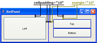
The XML Layout Editor has the ability to display the "cell lines" for the layout. This can be useful to see how the layout is being affected. The following image shows the layout with the cell lines shown in blue. The image also explains the cellpadding and margins that have been applied:

Notice that the cellpadding of 10 in the root <panel>
tag is applied to the left and right cells. The second <cell> tag
within the root <panel> plays the part of both cell and panel
because of the nested <row> tags. Since the cell is both a cell
and a panel, the attributes from both are applicable. So in this case, the margin
attribute is applied. You can see how the margin is actually part of the subpanel because it
wraps around both of the top and bottom buttons.
"Floating" Components and Alignment
Most of the previous examples have been using the stretch attribute to
cause the component to use all of the available space. This isn't always the desired behavior, and
it isn't the default behavior. By default a component will be set to its preferred size and will
"float" inside the available cell space. Alignment of the component then becomes a factor. The
following example shows the alignment effects possible. The panel image shows the cell boundary
lines to help visualize what the layout is doing.
<panel margin="10">
    <row height="100%">
        <cell width="33%" type="button" align="southeast">Southeast</cell>
        <cell width="34%" type="button" align="center">Center</cell>
        <cell width="33%" type="button">No align</cell>
    </row>
</panel>

Using Some of Everything
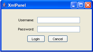
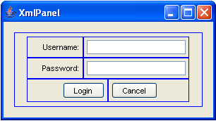
Now we'll use a little bit of everything to build a panel that is a little more useful. Below is the XML for a simple login screen. Images of the layout with and without the cell lines are shown as well.
<panel margin="15">
    <row height="100%">
        <cell width="100%" align="center" cellpadding="5">
            <row>
                <cell align="right" width="80">Username:</cell>
                <cell type="text" width="150" stretch="horizontal"/>
            </row>
            <row>
                <cell align="right" width="80">Password:</cell>
                <cell type="text" width="150" stretch="horizontal"/>
            </row>
            <row>
                <cell width="50%" type="button" align="right">Login</cell>
                <cell width="50%" type="button">Cancel</cell>
            </row>
        </cell>
    </row>
</panel>


Notice the use of the outer single cell panel to get the "centering" effect. Take this XML example and try it in the test panel. Resize the window to see the effects of the layout with different window sizes.
Next: Component Factory